A branding case study for a historic property in need of a new look inside & out
The Challenge
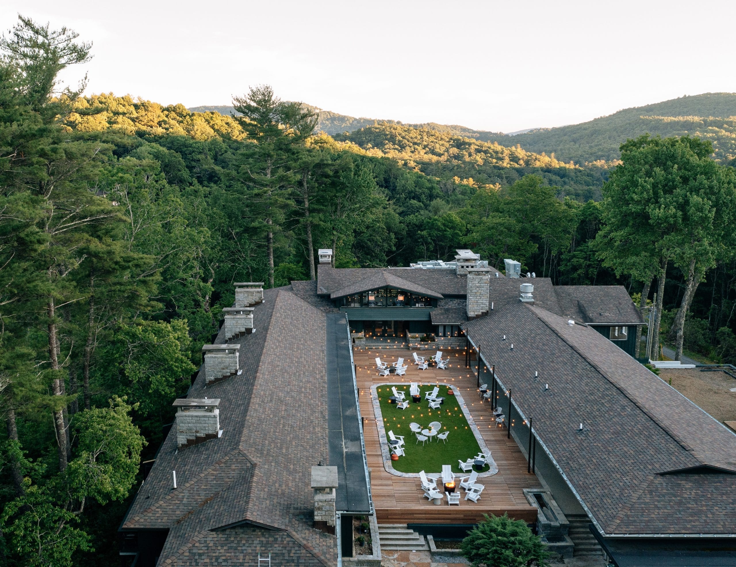
Award-winning hospitality group The Indigo Road came to Sprouthouse in the early stages of purchasing and renovating a historic motor lodge located in the charming Blue Ridge Mountains of Highlands, North Carolina. Aiming to revitalize and restore this special property, the goal was to maintain the charm of the lodge’s original architecture and foundational interior pieces, while also elevating the look, service, and amenities to offer a more refined, modern-day experience for the guest.
The Process
The Sprouthouse creative services team started by meeting with The Indigo Road team as well as their interior design and architecture partners to better understand the overall project, including the property’s storied history, unique architectural elements (designed by a protégé of Frank Lloyd Wright!), and the group’s vision for the future.
From there, we presented several potential design directions that took into consideration the property’s unique audience and location. The exploration process allows our creative team to not only understand what the brand ‘is,’ but also what it ‘is not.’ We determined the coined Skyline Lodge branding would sport a playful, mid-century modern aesthetic to match the spirit of the architecture as well as the casual mountain vibe of the Highlands community.
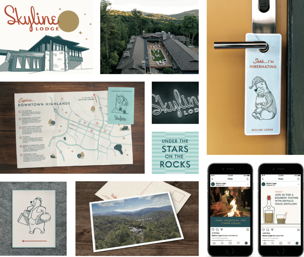
Our creative services team got to work developing a full branding system for the entire property, including a visual brand identity and designs for everything from logos to signage and marketing materials for both the lodge and its on-site restaurant, Oak Steakhouse.
Services Provided:
+ Logo design
+ Brand guidelines and assets (colors, type, icons, etc.)
+ Stationery / letterhead / business cards
+ Guest collateral (key cards, compendium, etc.)
+ Sales collateral design
+ Marketing (print ad design, billboards, copywriting)
+ Signage (exterior and interior)
+ Merchandise
+ Social media graphics
+ Website creative direction

The Results
A character, a black bear named ‘Butler’, was developed to serve as a connective thread throughout the designs to add to the overall playfulness of the property. Different actions of Butler—from hiking to cleaning—were created to be utilized for different materials. Of course, Butler also made his way onto the hotel’s merch, so you don’t have to leave him behind after your stay!


The architecture of the property, with its distinct roofline, was also highlighted in the hotel branding in many ways, from a mid-century illustration of it for a billboard and print ad, to a pattern that was an abstraction of its angular roofline.

Instead of doing a ‘typical’ in-room compendium, the Sprouthouse creative services team created a folding map that delivered pertinent guest information as well as a guide to the surrounding area and hiking trails, calling out specific favorite places for guests to explore during their visit. This approach reinforced the spirited nature of the property and the explorer personality the brand sought to exude.
Interested in learning more about hotel branding or our other creative services?
We’d love to hear from you.
Drop us a line at grow@sprouthouseagency.com.

